

John Varley checks out Cruz Ortiz
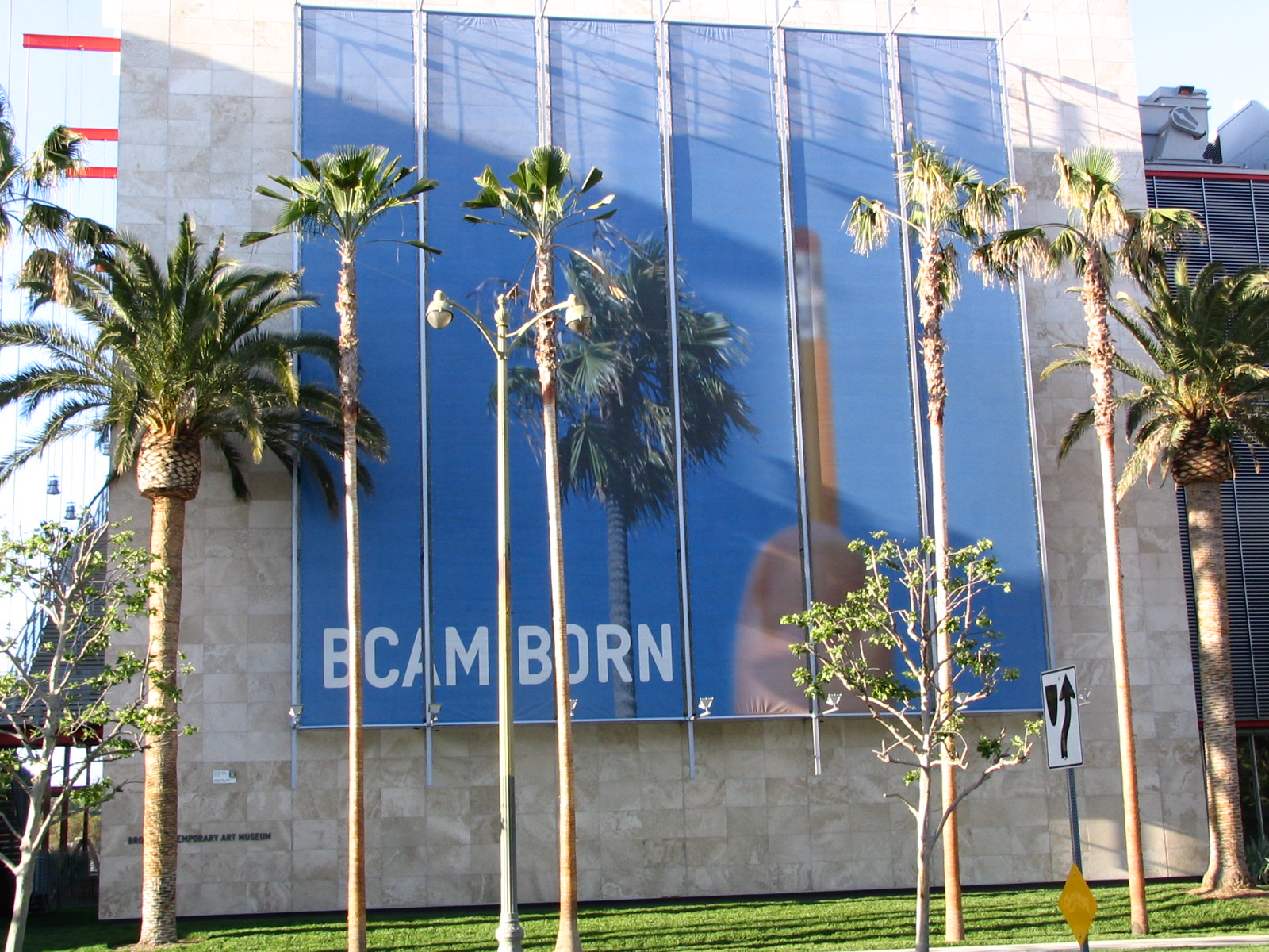
If the above acronym soup is confusing to you, let me translate: BCAM is the Broad Contemporary Art Museum, and LACMA is the Los Angeles County Museum of Art. (We Angelenos say it as “The Bee-cam at the Lackma.”) BCAM is a new building at LACMA, the first part of a three-phase expansion plan. It opened in February. Crowds were large and tickets hard to get, so we waited about a month, and then took advantage of the “Free After Five!” deal sponsored by Target, which means that for three hours every day, the museum is … free! (Except for special exhibitions.)
Eli Broad (rhymes with road), Los Angeles billionaire and collector, donated much of the money for the new building. He was going to give his entire gigantic collection of contemporary art to LACMA … until a few days before the new building opened. Then he changed his mind. We used to use the politically incorrect [and historically inaccurate] term “Indian giver” for such a person. I think, at heart, he’s a hoarder, and if he were poor he might be living in a trailer with 80 sickly cats and a million old newspapers. When it came time to actually part with his shit, he couldn’t do it. He gave the excuse that he didn’t want to see the majority of his collection go into LACMA’s vaults, to be seen infrequently, so instead a foundation will own all his stuff and loan it out to art institutions all over the world. Which makes some sense, but still … not a nice thing to do.
LACMA is something of a hodge-podge of buildings, ranging from the beautiful Pavilion of Japanese Art through the Ahmanson Building, the Bing Center, and the Lytton Gallery all the way to the old streamline moderne May Company building. Some of these buildings are interconnected in ways that are often not obvious, and the interiors tend to be something of a rat maze, so that you may find yourself, to your possible surprise, coming out of a building you don’t remember going into. Large parts of the Ahmanson have been shut off during the new construction, but they’re open again now, and many things that had been hidden away are now on exhibition again.
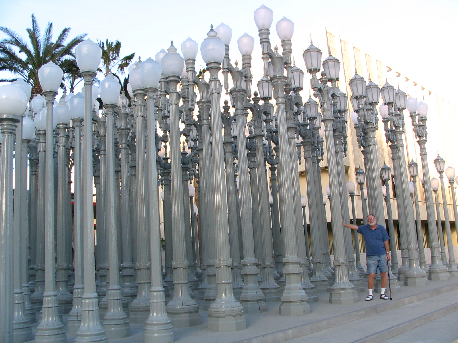
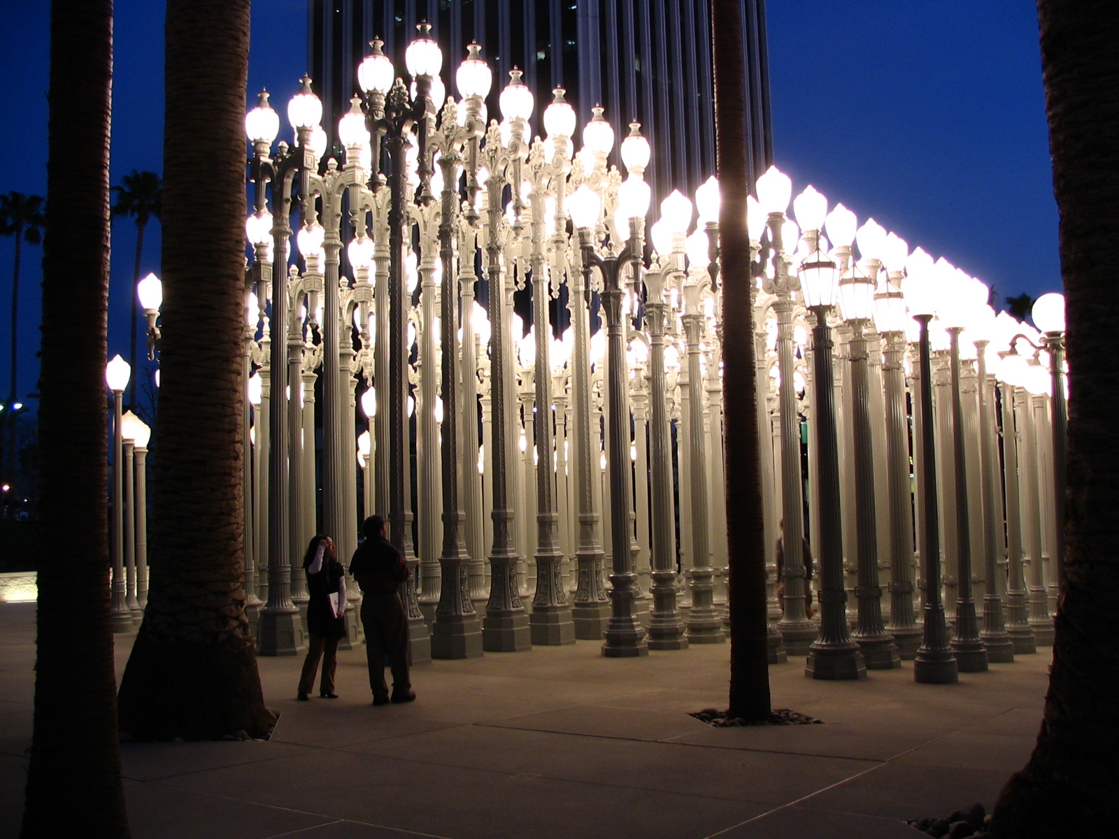
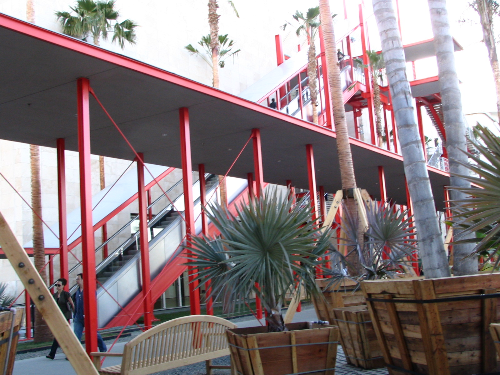
Phase One of the expansion and renovation includes not just the new Broad building but a new Grand Entrance between the Broad and the Ahmanson. The highlight of this plaza is an installation of streetlights that is nice enough during the day, and dazzling at night. This is by Chris Burden, who’s a lot calmer now than in the really crazed days of his youth, when one of his performance art pieces included having himself shot in the arm with a .22 rifle. I had always sort of wished the bullet had gone maybe six inches further toward the center of mass, say into his heart … but then we wouldn’t have had this nice new entrance plaza, would we?
Sadly, as is so often the case, Lee wasn’t allowed to take any pictures inside the Broad, so if you want to see what most of these pieces look like you should click on the links to see samples. You really should click on them. With many of these artists, it’s a case of “If you’ve seen one, you’ve seen them all.” These folks tend to settle on their particular “style” early on, and never deviate from it, to the point that you wonder what is the point, repeating basically the same picture over and over?
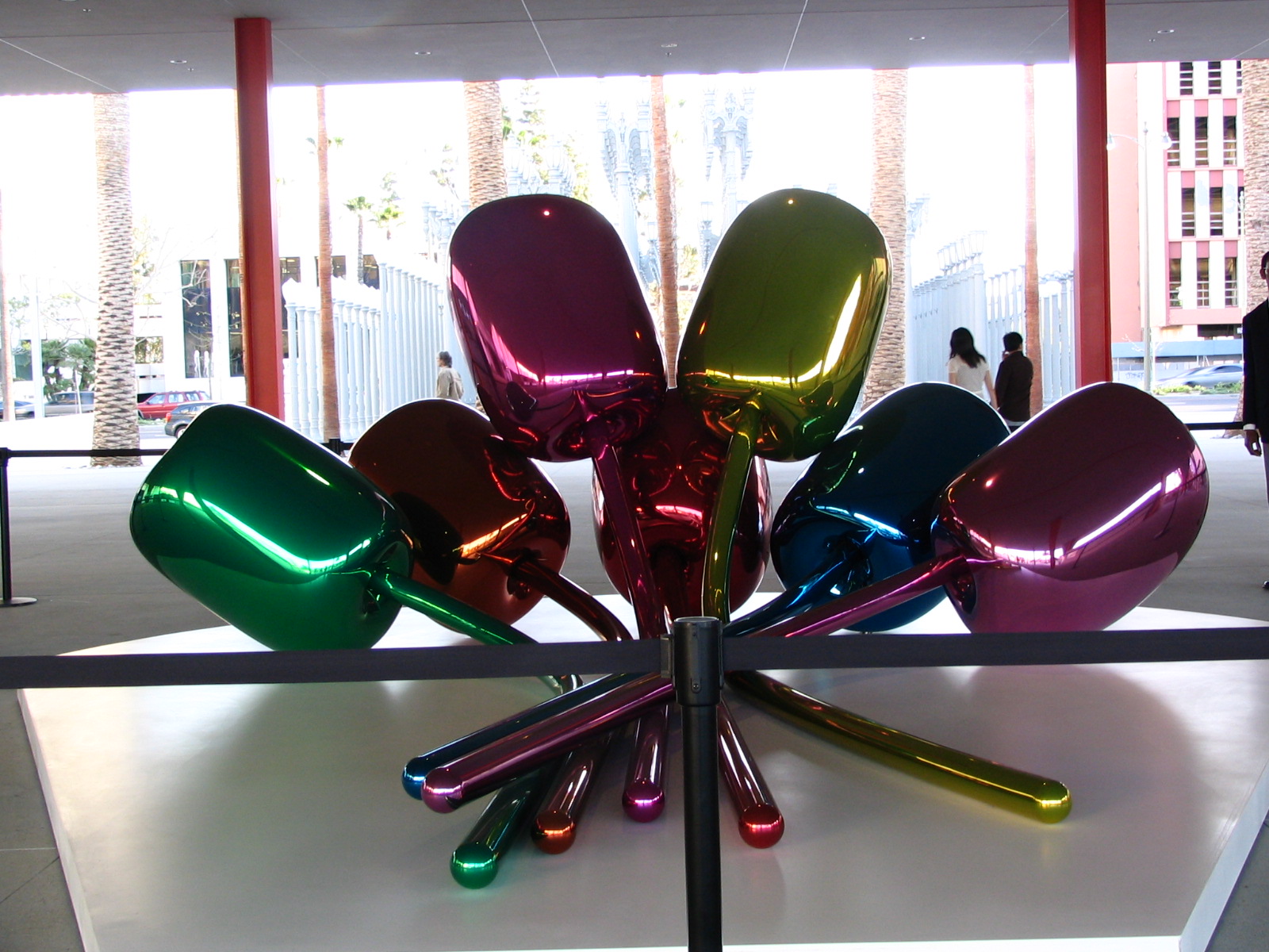
“Tulips”
There was one exhibit outside that exemplified a whole series of things inside, which were giant objects that looked variously like balloon animals or Christmas ornaments. The outside one, the only one we have a picture of, is called “Tulips.” It is very pretty, as are the ones inside, which include a 3-foot silver “inflatable” rabbit, a huge cracked egg, bright red on the outside, silver on the inside, and big enough for me to curl up in, and a 10-foot “Balloon Dog (Blue).” And as with many of the objects, you had to hand it to Jeff Koons, who made them, for the sheer technical, engineering challenge of creating these things. They look like inflatables, but they are not. They are made of metal, and coated with something that makes them shiny and reflective, just like a Christmas ball. Must have been a bitch to construct them.
So the first question anyone asks when looking at this stuff is, Is this Art? Is any of the stuff inside the Broad really fine art, like the “Mona Lisa” is fine art? You can make up your own mind, and all I can do is give you my own definition of art, honed over many years and still imperfect, and that is this: Art is anything that someone has created and calls art. I used to include the phrase “anything someone points to” and calls art, but that doesn’t cover performance art, which can’t be pointed to, or conceptual art, which, one might argue, is not even created. So maybe my definition needs some work … but basically, I am willing to grant the broadest possible scope to any definition of art.
Having done that, I retain the absolute right to determine for myself (without any reference to critical opinion) if it is good art or bad art, thoughtful art or silly art, pretentious, stupid, lame, idiotic, insulting to my intelligence, contemptuous of me … you see where I’m going, as most of the descriptive words I’ve used couldn’t be construed as flattering. Most avant-garde art of the last half century could be covered with one of the above terms, and I don’t mean good or thoughtful. However, I do like some of it, and that, in the end, is the main determining factor in my appreciation of “contemporary art.” Does it impress something on me? Anything, I’m not choosy. Often (I might even say usually) my main impression is: “What a lucrative scam this asshole has come up with!” But some of it is … fun. And/or funny. That’s what I like the best. I have seen very little contemporary art, of the sort displayed in the Broad, that moves me in any other way. This stuff just doesn’t tend to stir deep emotions. Admiration is usually about the best I can do, for the sheer in-your-face audacity of a particular trope.
Koons’s balloon stuff is funny. I feel good looking at it. He has a series of works inside featuring very meticulous copies of inflatable pool toys that are also delightful … and also a technical challenge to create. “Chain Link Fence” had two inflatable pool toys embedded in a fence. Of course, they aren’t real pool toys, though they are obsessively detailed down to tiny printed instructions and warnings in many languages. “Caterpillar Ladder” is just that, an “inflatable” caterpillar stuck though an ordinary folding aluminum ladder, straight off the shelf at Home Depot. I can appreciate these things, and once more (and far from the last time) I am most impressed with the technicall challenge of creating them. These are pieces that feature engineering and/or obsessiveness more than anything else. Koons has some stuff hanging on the walls that’s not nearly so whimsical, and bored me.
(By the way, if you want to really amuse yourself, there is no better source of humor in a modern art museum than the little plaques affixed to the wall that offer a brief, thoughtful analysis of the pretentious piece of crap you just looked at. It’s all unintentional, of course, art critics are not noted for snappy jokes. But I often have a hard time stopping myself from snickering out loud at the incredibly stupid things they write. Sometimes I have the almost irresistible urge to shout “Bullshit!” at the top of my lungs. I restrain myself. I’m a guest here, and I didn’t pay to get in.)

The other major piece in the entrance plaza is a full-scale model of a toy fire truck. (Read that sentence again; it does make sense.) It was fascinating to look at it, since from a distance it could pass for a real fire truck: it’s 46 feet long. It was only as you got closer that you realized it was made of plastic and/or Fiberglas and/or steel (I haven’t been able to determine the medium for sure), and lacked many details. It’s by Charles Ray, and for once I can understand some of the terms critics are so fond of, like “tension.” There really is a tension between your expectations of this big red object and the craziness of blowing up a toy to the size of the real thing. It is fun, and could have been even more fun … but what do they do? Why, naturally they rope it off. This is great art, doncha know, and mustn’t be touched. Bullshit! It’s fun art, and why not let people have fun on it?
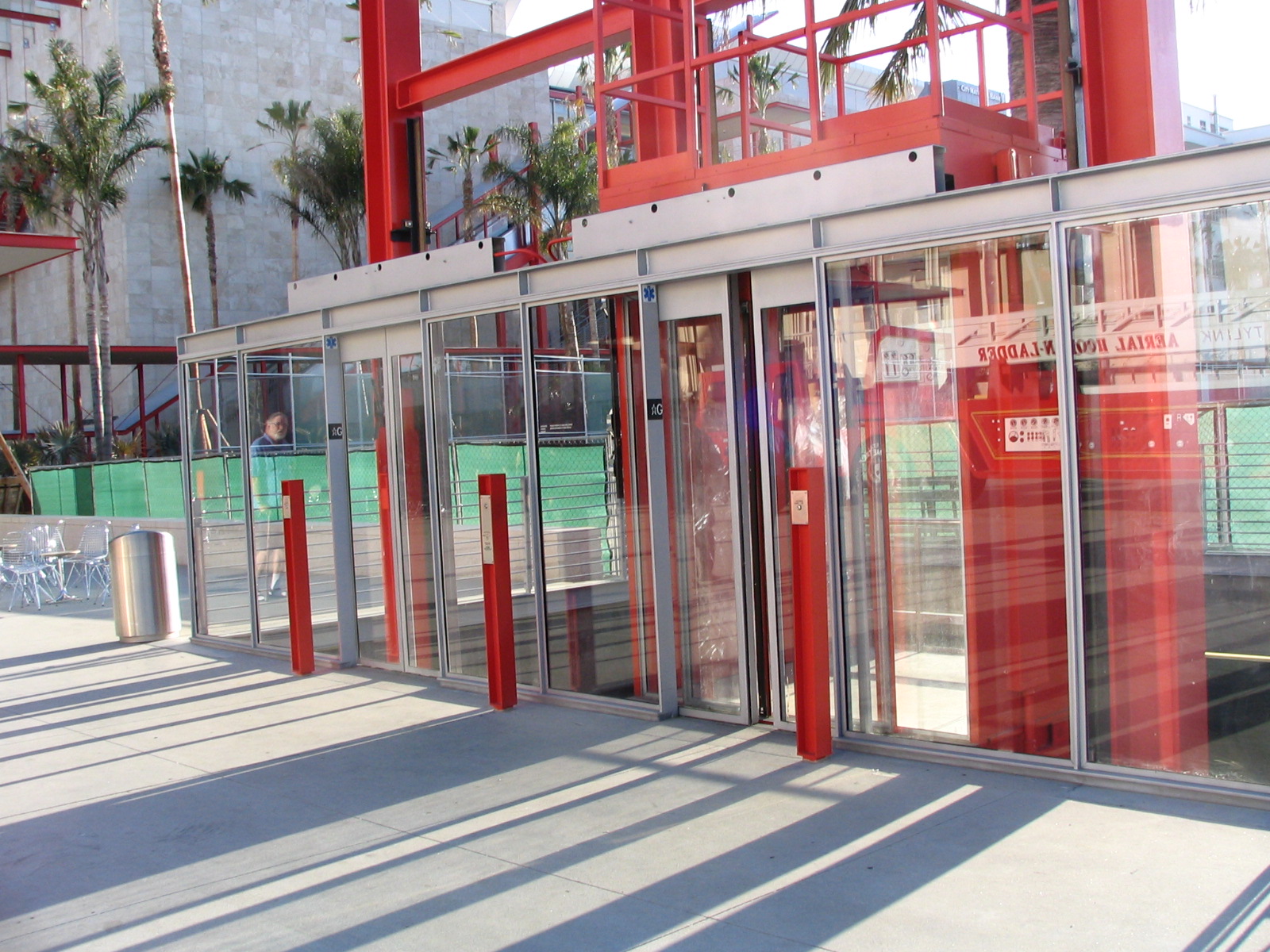
Elsewhere on the plaza are some very large palm trees in pots. At first we thought they were awaiting transplanting, but looking closer we concluded they were meant to be that way, braced with wooden poles. And I discovered after getting back home that they are, in fact, part of an installation by Robert Irwin, called … oddly enough … “Palm Garden.” See, anything can be art! In fact, the whole BCAM building and even the elevator to the underground parking garage, designed by Renzo Piano, can be regarded as an integrated art work. Even the long, long outdoor escalator has a name: “The Spider.” The elevator to the new underground parking garage is as minimalist as it gets, all extraneous parts taken away until nothing but the necessities are left. I liked it.
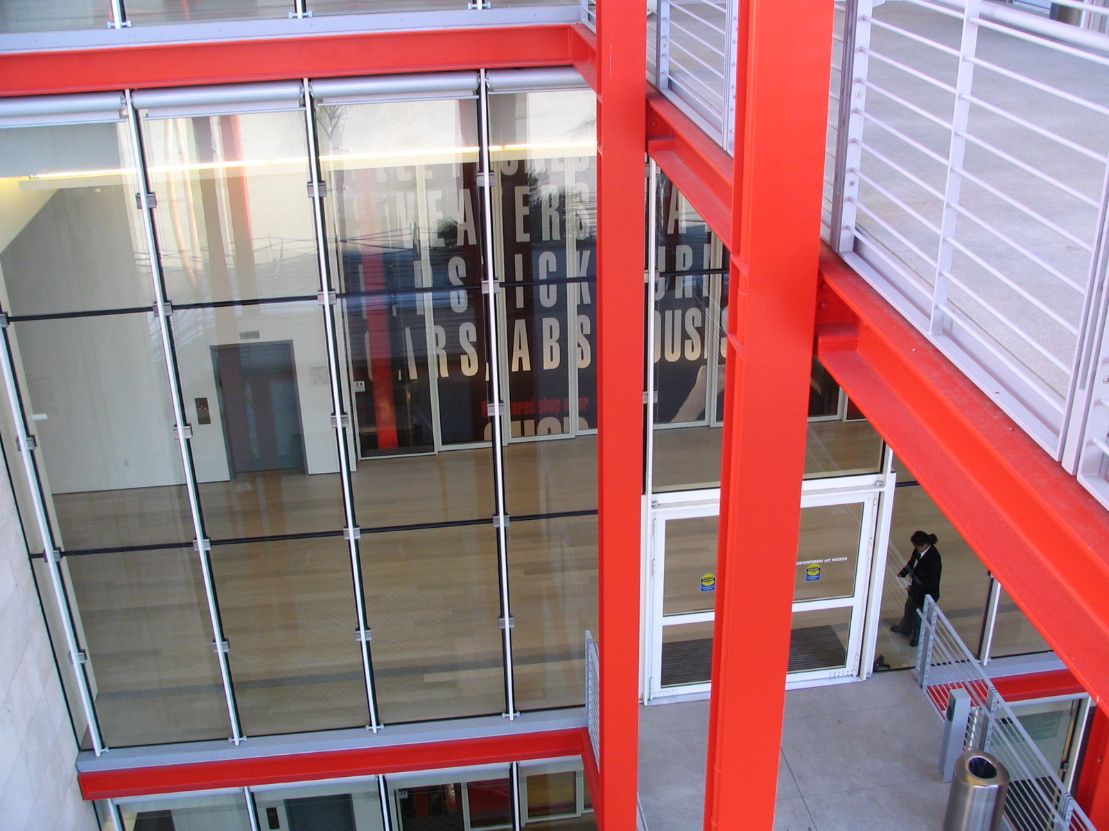
You enter the Bee-cam, oddly enough, on the third floor. The escalator takes you up there and gives you a grand view of Park La Brea and the Hollywood Hills.
First thing you see when you enter is a lot of gigantic words painted on a wall behind a glass wall. It took me a moment to realize that this was the huge freight elevator. Many contemporary art works are Brobdingnagian, and this is the only way to move them. It was clever of them, we thought, to use all that blank wall space in the elevator shaft for a three-story art installation, certainly the tallest work here. It is by Barbara Kruger and is called “Untitled (Shafted).” The elevator car is big enough to accommodate four or five elephants, and tall enough for a dozen giraffes. It’s quite a ride, though quite slow. Much of Kruger’s art is quite similar. Her work involves large words and some pictures that might have been clipped from comics or newspapers and blown up, all in black and white and red, all with the same typeface: Futura Bold Oblique. She also has something called a “viral public art” exhibition, called “Women in the City.” There are three other women involved. Kruger’s contribution includes a big video screen on top of LACMA West, the old May Company building, and others on Sunset Boulevard. Her part is called Plenty. I see from their website that all but one of these exhibitions of conceptual art has now ended.
There’s a lot of “word art” in the BCAM. One guy, John Baldessari, seems to do nothing but that sort of silliness. Most of his works (and there were all too many of them) consist of blank canvases with a smart-ass observation lettered on them. One that stood out was “Tips for Artists,” lettered in 1968, which makes it fairly ancient next to most of the stuff in here. This is a sophomorically snarky series of three tips, like this one:
* SUBJECTS THAT SELL WELL: MADONNA AND CHILD, LANDSCAPES, STILL LIFES (FREE OF MORBID PROPS – – – DEAD BIRDS, ETC.) NUDES, MARINE PICTURES, ABSTRACTS AND SURREALISM.
The other rules are just as condescending. What does this all mean? What would I write if I were writing the little card to be affixed to the wall, explaining this work of art? Something like this:
“Baldessari expresses here his disgust with any concept of popularity, his determination to transcend the limits of ‘good’ art, and to consistently create only things that are truly impenetrable, insulting to the viewer, or just plain awful. A secondary theme is a disdain for those who would paint with an audience in mind, who would stoop to ‘catering’ to the ‘masses.’ He reserves his highest contempt—and contempt is all he has to offer us—for those who ‘sell out,’ who concern themselves with money … though he was paid a shitload of money for this stupid piece. He might have earned even more if it had a real dead bird stuck to it.”
How’m I doing? You think I’m ready to publish in a prestigious art journal?
Another of Baldessari’s canvases has this to say: EVERYTHING HAS BEEN PURGED FROM THIS PAINTING BUT ART, NO IDEAS HAVE ENTERED THIS WORK. Well, snark, snark, snark, you pompous son of a bitch. (By the way, this fellow is a professor at UCLA, as was Chris Burden, until recently—some flapdoodle about a student bringing a gun to class in homage to Burden’s .22 rifle piece, and Burden was forced to resign his position. Guns in campus art don’t play quite the same in the age of Columbine and Virginia Tech as they did in Burden’s heyday. Your child wants an art education, these are the talent-free mopes who will teach them. But that’s a whole nother rant.)
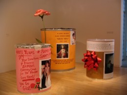
-

- Margarita Cabrera
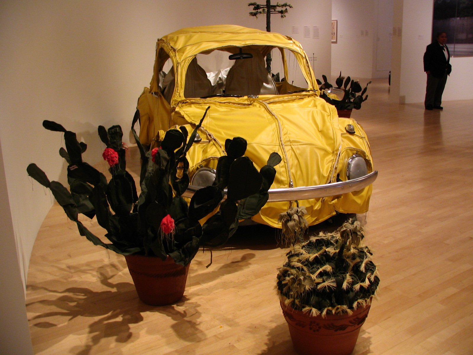
-
- “Sweet William”

-
- “Soy Natural”

And you think I’m kidding about sticking a dead bird into your work? One piece here, “Canyon,” by Robert Rauschenberg, which has been referred to as “seminal,” consists of a canvas partially painted, mostly in splashes of black, with a dead bird seeming to fly out of it (I thought it was a crow, but they say it’s an eagle), and a sandbag hanging off one corner. He did a lot of things like this, called “combines,” with a stuffed goat and other trash. The story goes that an abstract expressionist painter looked at it and said: “If this is modern art, then I quit!” Which is ironic, because abstract expressionism is the point in art history where the huge majority of ordinary humans quit, too. They quit trying to understand modern art. I can’t blame them. Rauschenberg is a real piece of work (and the only interesting person to come out of Port Arthur, Texas, until Janis Joplin came along!). When a lot of artists were asked to create portraits of a gallery owner named Iris Clert, he sent a telegram that was dutifully put up on the wall. The telegram said “This is a portrait of Iris Clert if I say so.” So arrogant, so snotty, so insufferable. It was funny and thought-provoking in 1929, in “The Treachery of Images” when René Magritte painted a pipe and wrote under it Ceci n’est pas une pipe (This is not a pipe.) Of course, it isn’t a pipe, it’s an image of a pipe. But the joke is pretty stale now, even if you add the contempt for the viewer that is typical of so much modern art.
So was everything here crap? Not at all. Some of it was fascinating. Some of my favorites were by a guy named Damien Hirst. He likes to work with things that were once alive, or even with living things, but he has more of a sense of humor about it than Rauschenberg, and he has some wit, and some sense of beauty, which is almost unheard-of in contemporary art. His most impressive work was “The Kingdom of the Father,” which was three huge panels, evocative of stained glass windows, completely covered with iridescent butterfly wings. There were thousands of them, arranged symmetrically, kaleidoscopically. I was a bit disappointed to learn that he didn’t to the actual gluing of wings to canvas; he just laid out the pattern and let his acolytes do the grunt work. I know, that was a common practice among the old masters, which is why some canvases are labeled “school of.” But I’d have respected him more if he’d done this dazzling work himself.
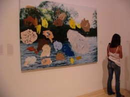
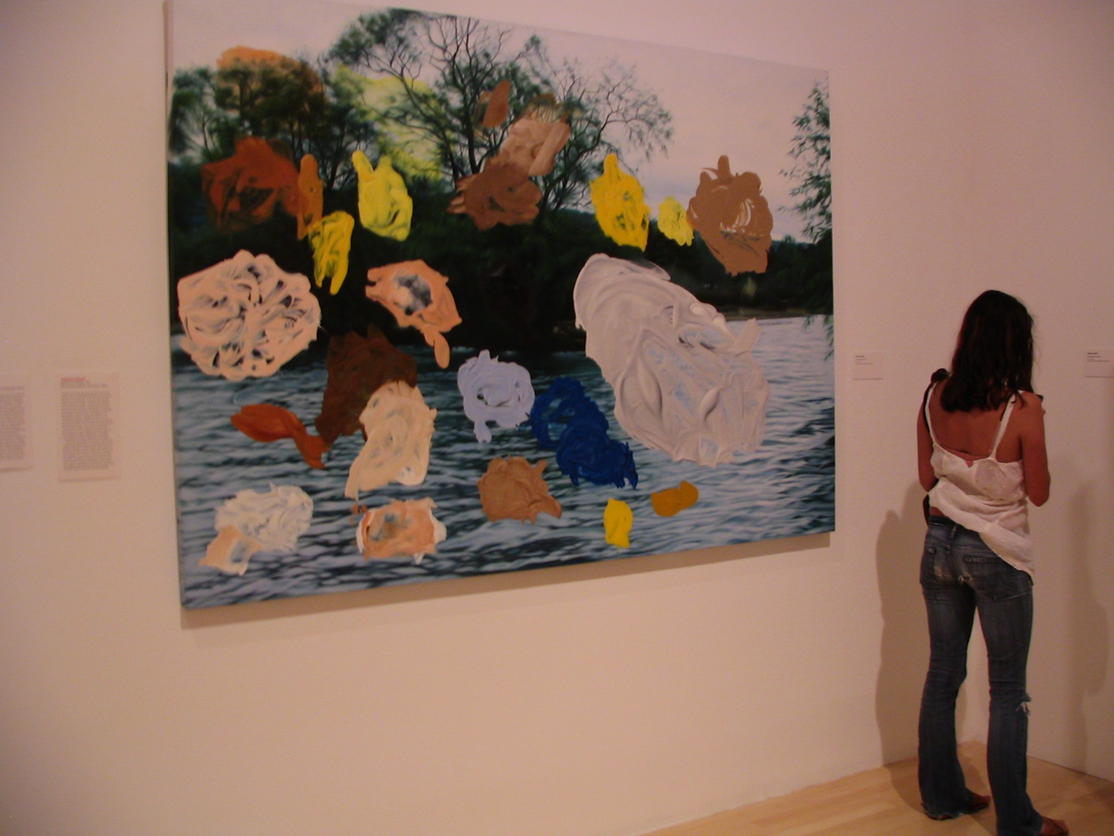
-

- “One and the Same”
-
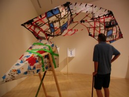
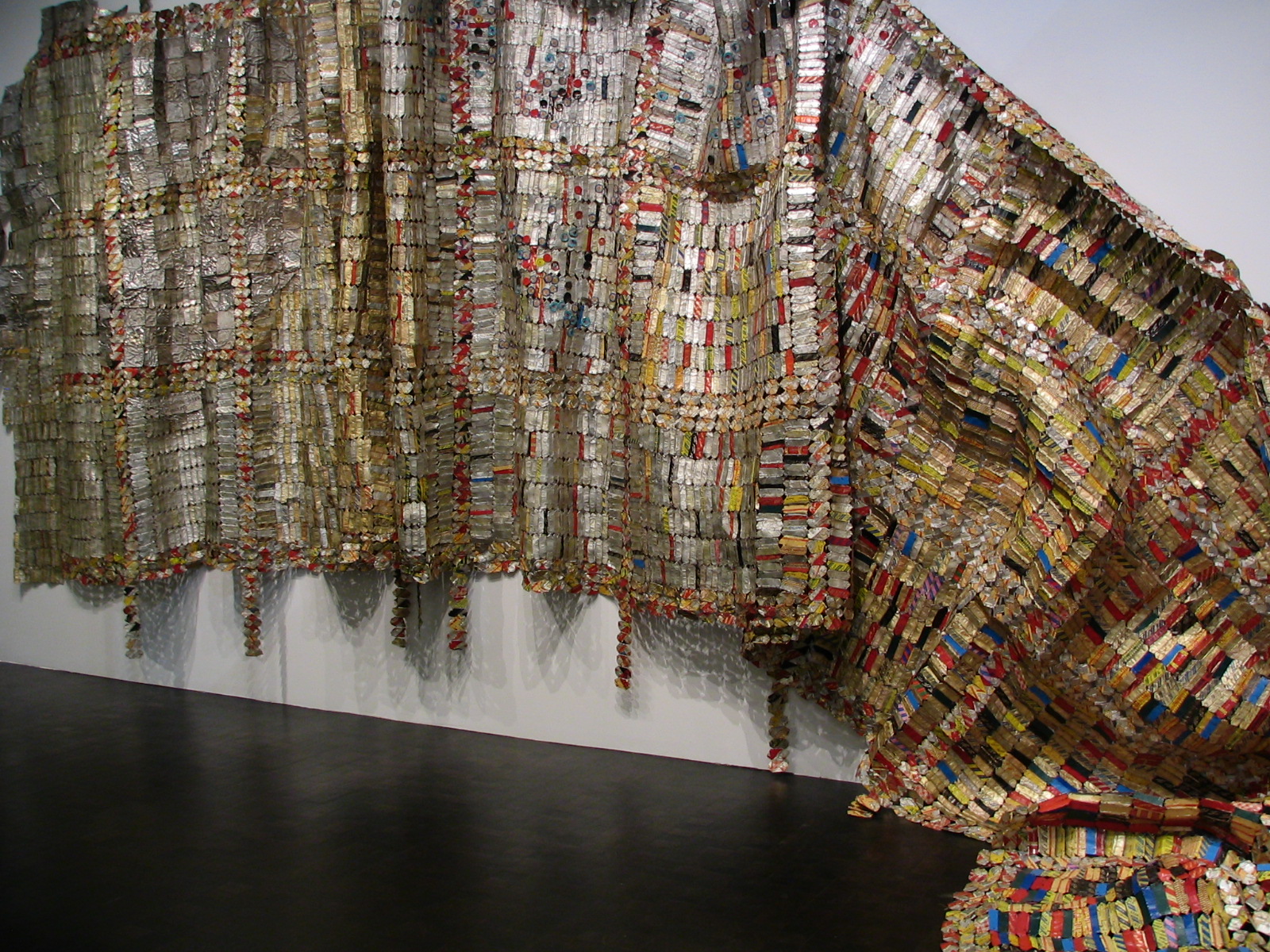
- John Varley checks out Cruz Ortiz

-
- More Cruz Ortiz
Another work, “The Collector,” was a glassed in space with a lot of potted plants and an audio-animatronic dummy inside. The dummy was a scientist looking into a microscope, and every once in a while he’d straighten up and look around. The potted plants were alive, and so were some butterflies inside with the dummy.
What’s it mean? I dunno. I don’t demand that art mean something, in fact I often like it better if it doesn’t or if the meaning isn’t apparent to me. Again, thoughts of a practical nature arose. Does a curator or a gardener water these plants? If this thing is part of the permanent collection, did LACMA sign on to tend it in perpetuity? There are a lot of cut flowers. How often are they replaced? They all look fresh. Butterflies don’t live a long time. Did the artist specify how many should be in the exhibit? Where do they buy their butterflies to replace the dead ones? And has PETA heard about this dude? He killed a serious number of beautiful insects to make his other works.
Which is nothing compared to his most startling work here, which is one of many he has created featuring dead animals, some dissected, some whole. The one they have here is called “Away From the Flock.” It’s a pickled sheep. A lamb floating inside a glass tank. (He did something similar featuring a 14 foot tiger shark, and sold it for $8,000,000. You heard right, a pickled shark for eight big ones.) Art works on display in museums always include a plaque that describes the medium. You know: oil on canvas, tempura on paper, marble and iron. This one was a hoot: “Steel, glass, formaldehyde solution, lamb.”
More Hirst stuff: A very large glass case full of glass shelves holding animal skeletons. Again, I doubt he picked the flesh off these things, I’m pretty sure he bought them, made a case for them, put it in a gallery, and called it art. Okay, like I said, I will call it art, too. Jigsaw puzzle art. Just put the pieces together. I have to say I liked it, but only as an object. It didn’t say anything. Neither did the huge set of three display cases against a wall, crammed full of drugstore items, with a human skull here and there. Dull. How long can you stare at 100 boxes of cotton swabs and ponder the meaning of life? In my case, not long.
-
- “Girl in Chair”

-

- “Identity 1”
-
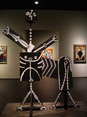
- “Centaur”

Some stuff here you just glance at and move on. Three basketballs floating in an aquarium tank. Okay. The only thought that one inspired in me is the thought I have for so many of the works here: How did the artist convince anyone to buy this? Six floor polishers and a vacuum cleaner with fluorescent tubes in a big Plexiglas structure. Boooring!
Then the usual suspects. A stack of Kellogg’s Corn Flakes boxes by Andy Warhol. Also Warhol photos of Elvis, Marilyn, and Jackie. Instead of the tomato soup can I’m familiar with, they had a canvas of a clam chowder can. How startling! Andy’s in a new Campbell Period! Even better, a painting of a pepper pot soup can that had been crumpled and pasted to another canvas.
Mr. Koons of the inflatable toys also had a ghastly, life-sized Michael Jackson and his pet monkey, of glazed ceramic. Also a long, lovely silver train: Medium “Steel, Jim Beam Bourbon.” I don’t know if these train cars were found objects that used to contain bourbon (or maybe still do) or if he made them.
Ed Ruscha had a painting of Norm’s diner here in Los Angeles. Competent.
We liked the Lichtenstein comic panels, always have, though again, they seem more like art school exercises than any real imagination. The only one that really spoke to me, emotionally, was the famous “Cold Shoulder,” which shows a woman from the back, with a word balloon dripping icicles, saying “Hello …” Sad.
A real phony: Ellsworth Kelly. He’s a minimalist, and the five objects he has here are mostly large canvases painted a single color: “Blue curve III,” “Blue Red,” “Green Angle,” “Blue Yellow Red IV,” and “White, Two Blacks.” If I know how to use a drawing program I could easily reproduce these masterworks for you. “White, Two Blacks” is a white stripe down the middle of a black canvas. That’s it. My minimalist review: Beyond stupid. And the appreciation on the wall from some art critic is maybe the funniest of a funny lot. Can you imagine coming up with something quasi-intelligent to say about a 12-foot boomerang-shaped canvas painted a uniform, sprayed-on blue? Something complimentary, anyway.
Jasper Johns. At least his works look like something, even if I don’t always know what.
Cy Twombly is maybe the biggest phony of all. His huge canvases are partially covered with perfectly awful kindergarten scrawls, reminding me of graffiti in a restroom for retarded kids, maybe. People often say “My kid could paint that!” when they see this sort of stuff. Well, usually they’re wrong, usually there is some sense of composition going on. But not with Twombly. Your kid could paint that. And better.
-
- “Miracle Cans”

-
- “Painted Memories”
-

- “Bean & Cheese”
If you’re not bored out of your mind already, let’s go down to the second floor. I promise I won’t take so long down here.
I like this floor a little better. More whimsical stuff, including a giant dining room table and chairs called “Under the Table,” by Robert Therrien. By giant, mean like Lily Tomlin used to sit in on “Laugh-In” when she was being the little girl, Edith Ann. What does it mean? What great comment does it make on the world around us? I dunno. I just like walking under it. Again, like the fire truck outside, they should provide a stepladder and allow you to sit in the chairs, have your picture taken. So many of these objects have nothing going for them but a sense of fun, and the curators don’t understand fun, they’re too serious …
Cindy Sherman has one whole room. Like a lot of female artists from the ‘60s to the present, she seems fascinated with her own body. What she does is, she photographs herself, but in costumes and make-up so that, if the accompanying material didn’t tell you, you’d never know it was her. She has 22 self-portraits on one wall, and there are 16 others, all untitled. She is very, very good as a make-up artist and a photographer.
Jenny Holzer give us something called “Under a Rock,” which is 10 marble benches with messages carved in them, which I didn’t bother to read. I don’t come to an art museum to read the artist’s thoughts which, when I have bothered to read them, are usually either insipid or New Agey. As Eliza Doolittle sang, show me, don’t tell me. The benches are facing a long LED display that spells out more words and phrases, and for once, you can sit on the benches and read the LED. I didn’t read that, either.
And here’s old Chris “shot-in-the-arm” Burden again. He’s a lot more fun when he’s making stuff instead of having himself nailed to the hood of a VW bug. (Yes, he did that, too. He liked personal danger and pain.) He’s got 4 surreally large police uniforms hanging on a wall. These outfits would fit 7½-foot-tall cops. It was some sort of comment on the Watts riots, I gathered. Then a real puzzler. “Hellgate” is a scale model of a New York bridge, made out of “antique Erector and Mechano pieces.” It is 28 feet long! Now, other than being a monument to obsessiveness, can anyone tell me how this is different from the nutcase who builds a model of St. Peter’s Cathedral out of Popsicle sticks? Say you or I put this thing together (assuming we could afford the thousands of dollars he must have paid for these antique toys, which ain’t cheap). Would it be displayed in the BCAM? Of course it wouldn’t. Maybe at the craft pavilion of the county fair, where it would certainly win a blue ribbon. But because it was assembled by Chris Burden, it becomes an art object taken seriously by people like Eli Broad, who paid a lot of money for it, and now has to worry about moving it around. Frankly, I loved it, as an object. I’m a sucker for scale models. But as a work of art, it’s shitty. I’ve seen better at Legoland. I like Legoland (in principle; I’ve never been there, but I’ve seen some of the things they make), but I don’t call the things there great art.
Really not much else to see on this floor. There was a terribly pretentious video room, “Gym Interior,” by Mike Kelley, with odd objects thrown together at random and screens showing women dancing, poorly. Julien Schnabel (who made the critically acclaimed movie The Diving Bell and the Butterfly and another, Basquiat) offered us a gigantic canvas covered with broken dishes. Leon Golub had five huge images of police violence, on canvas, unframed, just hanging there. They have a few things by Jean-Michel Basquiat (an Andy Warhol discovery, dead at 28 from a junk OD), mostly doodles. He got his start in graffiti, and that’s what this stuff looks like. There was one canvas I liked, but it’s untitled, so I have a hard time telling you which one it was. It was a multi-colored face/head/skull, an image that shows up in a lot of his work.
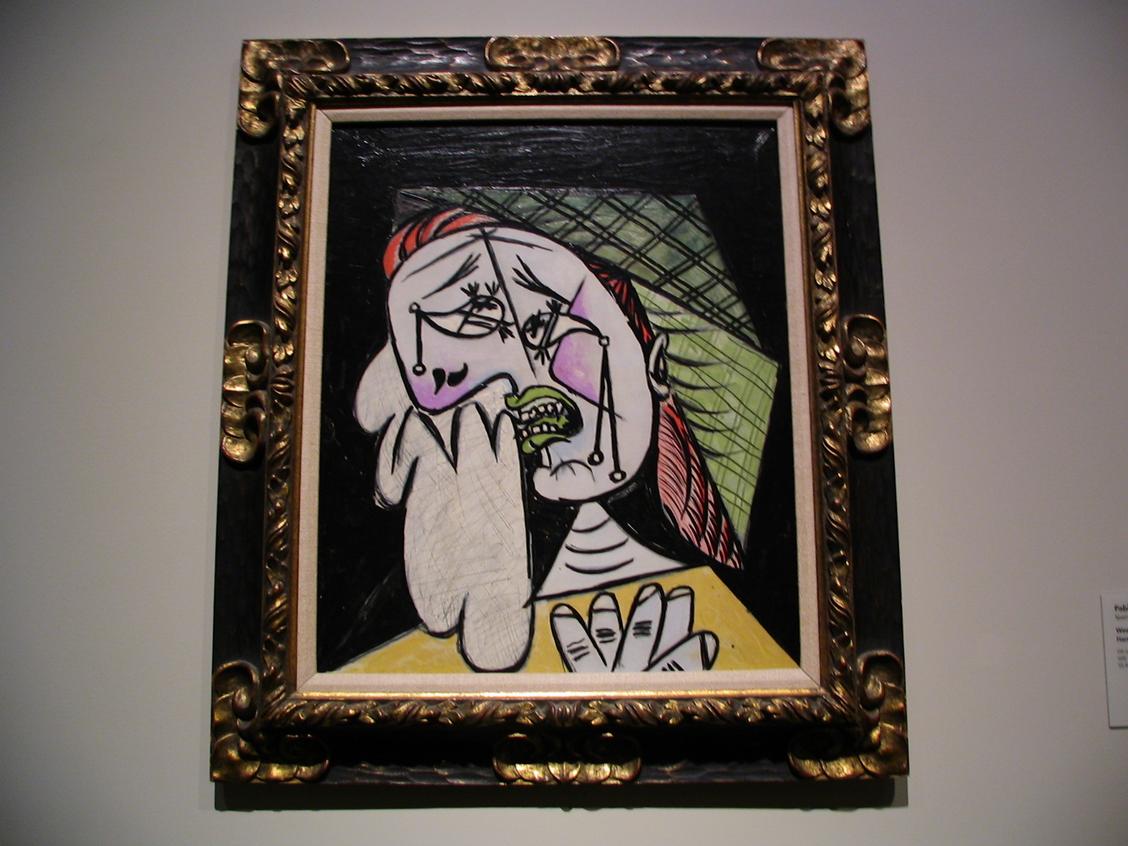
-
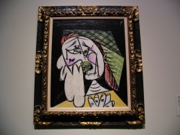
- “Weeping Woman with Handkerchief”
-
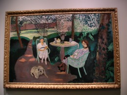
- “Tea”

-

- “Fading Scroll”
Now down to the first floor. This won’t take long.
The entire first floor consists of two large rooms, and they contain two massive works by Richard Serra, “Band” and “Sequence.” “Band” is a series of cul-de-sacs, and “Sequence” leads you through a long maze of curving steel walls, almost 13 feet high. Lee and I both liked them, preferring the maze, and there is no doubt they were engineering marvels and aesthetically pleasing as well … but why indoors? Why occupy an entire floor with two installations that sure have the look of permanence. I think you’d have to knock out a wall to get them out. He has other similarly massive works installed indoors at other places, I found pictures of them on the Net. There are also many that are outdoors, and that just seems to me to be the right environment for them. As an added plus, it would free up this floor for more works. I mean, it just feels sort of like hogging.
There it is, the BCAM, for better or worse … or maybe a bit of both. I enjoyed my visit, and I’ll go back again … but our next trip to LACMA will be to see the newly-reopened parts of the Ahmanson, which includes a great collection of early 20th Century art, including Picasso, Magritte, and Monet, who we much prefer. Also three new shows:
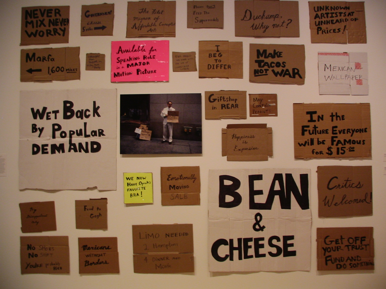
“Phantoms Sightings: Art After the Chicano Movement,”
“Tradition as Innovation in African Art,” and
“Doctrinal Nourishment: Art and Anarchism in the Time of James Ensor.” The illustration at the website for this one appears to be showing four crowned kings and mitered churchmen sitting on a wall, taking a shit down onto a mass of people … gotta go see what that’s all about.
April 28, 2008
Hollywood, California